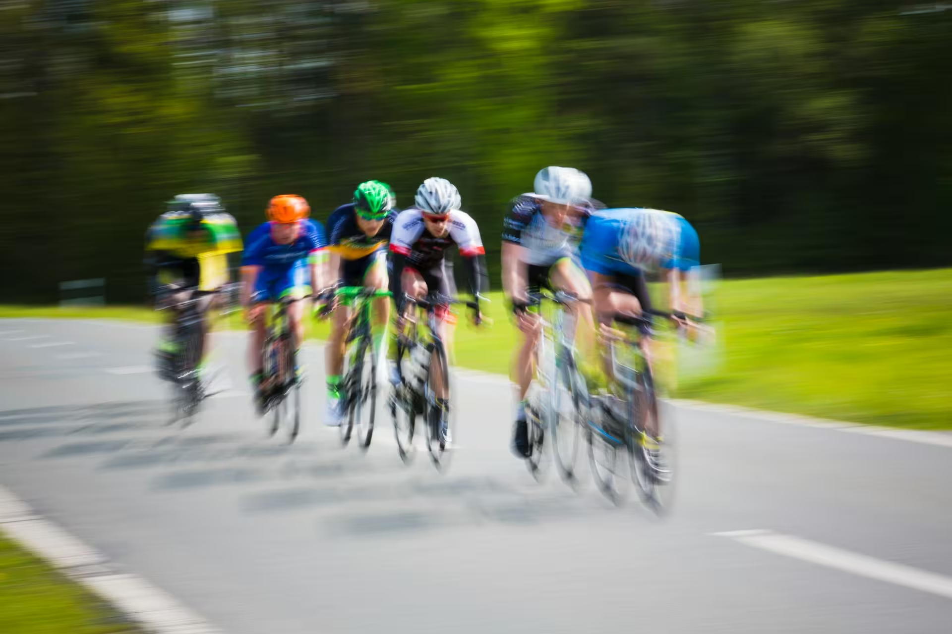
A performance cycling identity connecting riders, clubs, and kitThis project was built for Redline Inc across sport & cycling with a focus on identity, kit system, race graphics.Redline needed to unite independent riders and partner teams under one system without making them look identical. Every element had to remain legible on a moving rider, a small screen, or a race-day banner.
Brand System
A split-line R creates a directional mark that can be repeated as a route, a frame, or a speed stripe. Teams can change color and supporting graphics while the core gesture stays recognizable.
Typography
A condensed grotesque gives the wordmark and race numbers urgency, with a tabular monospace handling rider data, distances, and performance metrics.