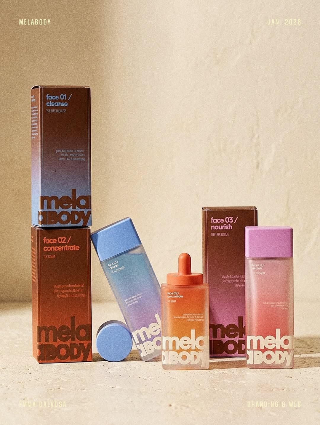
A tactile skincare brand built around body confidenceThis project was built for Melabody Inc across fashion & beauty with a focus on naming, packaging, art direction.Melabody needed to make a new body-care ritual feel personal in a crowded beauty market. The challenge was to balance clinical trust with a sense of pleasure and self-expression.
Brand System
A sculptural M mark and close-cropped body forms give the brand a confident, physical presence. Soft mineral tones and generous layouts make the products feel considered rather than precious.
Typography
A warm grotesque carries direct, body-positive headlines, paired with a compact sans for ingredients and usage details. The contrast keeps the voice intimate while preserving clarity on pack.